Categories
Presentation campaign graphic

Purpose and audience

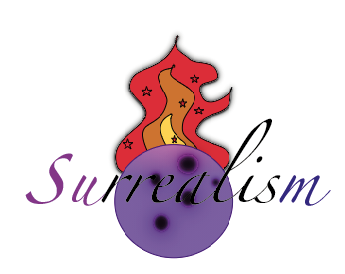
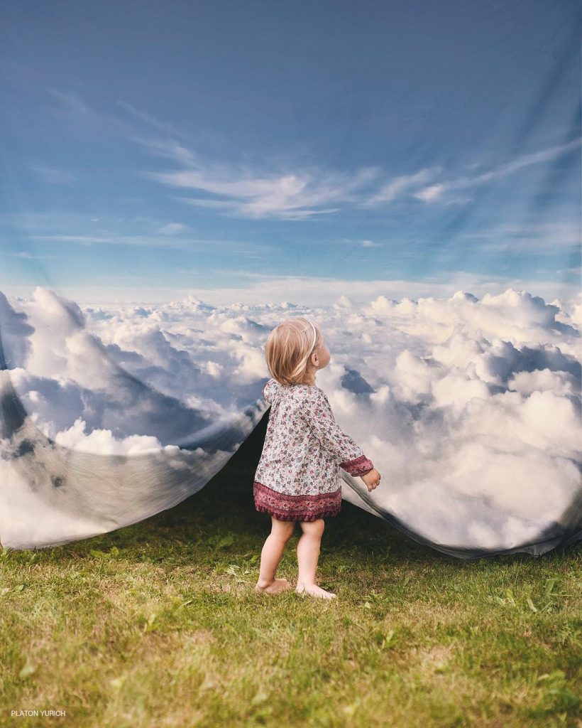
My campaign is surrealist bright artwork which is the opposite to the mundane lives people lead and filled with colour.

In New York, Sarah Grillo designed a brand and campaign for a community event called Revive L. The design included black and white photography with cleverly integrated colourful illustrations in order to create a different world. Sarah stated she photographed the commuters and then illustrated what “they’d rather be doing-drinking a cocktail or eating a taco”. I feel this campaign sends out a good message that everybody has complex and interesting lives beneath what you see and photography doesn’t have to comply with this; it can show what’s beneath the surface even if it’s not real.

Fig 1

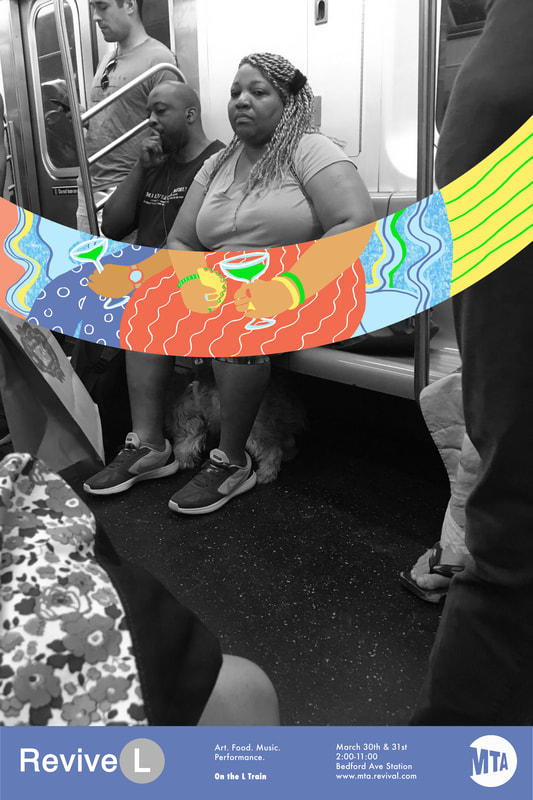
The illustrations show a clear contrast by being a total opposite to the background.

The use of colour of black and white contrasted with the bright colourful illustrations which take you into a different world is a great reflection on a campaign that brings peoples dreams into a reality through art. A lot like surrealist art which is often inspired by dreams. The illustrations themselves look very animated and childlike, bringing out that nostalgia of being carefree and the opposite to the mundane contrasted with the illustrations. Surrealism is often a random integration of things which almost make sense but don’t at the same time which I feel is represented through this campaign through the random use of colour and shapes along with the background photo. The people’s positions on the train are shown to almost align with the dreamlike fantasy illustrations. For example

Fig 2

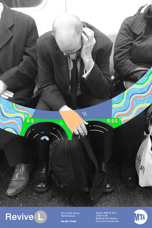
There is a new lease of life through through the campaign as it brightens what people might have thought was a bad day through art. I feel this is important as it brings something magical to peoples lives and sees the excitement in what would be usually seen as uninteresting.  

References:

Fig 1 & 2: http://www.sarahleegrillo.com/revive-l.html#

Categories
Presentation campaign graphic

Designing with shapes

I decided I wanted to create something especially surreal that told a story like in a dream. I did this by drawing fire and creating the shape of fire coming out of the moon as if it had been caught on fire by the sun. This reflects the surrealist art I’m inspired by as it often doesn’t make sense but can still be connected somehow. I added the shape of stars and dotted them within the fire. This gave the illusion of shooting stars. The use of fire also made sense to me because it was two different worlds colliding as there is no oxygen to fuel fire in space so the pairing of both earth and space helped create a surrealist theme.

I took a really abstract approach with the shape of the fire as I wanted the fire to not look real like the moon but still be recognisable for what it was. I made the shapes a lot bigger in order to make the design the forefront and to keep the colour gradient of the font exposed.

The colour of the fire I wanted to be the normal colours that a fire would have so it was recognisable and also because those colours contrast a lot with the deep purple of the moon. I decided I didn’t want to blend the colours together as much as the moon as I wanted that contrast between the two shapes to be clear. The moon being caught on fire is almost a silly childlike idea you would find in a children’s book or film which is exactly what I wanted to portray as it connects to my inspirations of Disney films. The random idea also links to dreams and surrealist art which is often inspired by dreams.

Categories
Presentation campaign graphic

Colour

When adding more colour, I decided I wanted to change the moon to a deep purple in order to make it stand out more. I created my own graphic out of circular shapes and blurred them in order to create the purple moon. I wanted the moons appearance to seem more animated then the sample from my previous logotype as I wanted it to reflect the Disney movie childlike inspirations I had. When surrealism comes in, I feel making the moon such a abstract colour helps get that message across. The fact that it doesn’t look like a real moon but almost a dreamlike version of a moon gives this message of surrealism too.

I created a light purple to dark purple gradient within the moon to give the appearance of shadows which would be casted on the moon. I also created a purple blur around the craters to make them catch people’s eyes. For the font itself I decided I wanted to change the colours to match the gradient of the moon, this I feel helps bring the font together. The first two letters I made a lighter purple then the middle letters I made black to ensure a contrast as they overlap the moon and the last letter, I made a deep blue/purple. The overall added colour I feel helps enhance my surreal dreamlike ideas as the colours pink and purple are not easily found in nature and especially not when you think of the moon. The font “surrealism” is created to look slanted and off balance which reflects the off-balance surreal nature of the moon itself. The colours being blurred and blended into one another really gives the moon the dreamlike appearance. Surrealist art is often said to be inspired from peoples dreams as it is random and out of this world

Categories
Presentation campaign graphic

Logotype

One of the main features presented within my logo is a pink moon. This represents the dreamlike aesthetics found on Instagram which Inspire me. They’re often pictures of things which are edited to almost become surreal like the pink moon. The colour pink itself is also really representative of myself as I often am intrigued by this colour within photography as it is very bright and eye-catching. The use of baby pink I feel also helps represent childlike nostalgia connected to my love for animated films as a child which included this colour a lot.

To match this the first and last letter are also pink in order to bring my logo together and for it to look more visually appealing.

The font itself can be seen as abstract and different due to the font difference of the first letter to the rest and how it is seen as bold and large. Its overall feel is extremely contrasted in order to create a eye-catching effect and draw your eyes in. I brought the fonts very close together in order to let it blend to create a sense of togetherness as my first and last name. This is because I wanted to ensure that it was all connected. I also achieved this look by putting the moon under the font, so it overlapped and looked seamless. I outlined the first and last letter to create a sense of boldness. The large first letter of my name is a representative of what is often used in child animated Disney movies. Overall my logo is abstract and different which is a aesthetic I was drawn to throughout my life and has inspired a lot of my work when creating.

references:

The pink moon:

https://www.kindpng.com/imgv/ixiJiww_pink-moon-png-pink-moon-transparent-background-png/

Categories
Presentation campaign graphic

Visual design influences

Within my life there’s been a lot of design influences which have shaped who I am today and what my interests are. One of these includes social media and to be specific, Instagram. This is because of the way it is themed around the way things look and is based around the importance of aesthetic as people only like the posts they like to look at. I am specifically interested in surrealist photography shown on instagram.

Fig 1:

Certain aspects of Instagram which include photography with enhanced dream like photos have always captivated me ever since I joined in 2016. Over the years I have become interested in photography and editing images to create something trippy and dreamlike. After seeing and following creators who like to manipulate and edit images to create surrealist photographic art. I feel I have found my own visual aesthetic through seeing these images growing up and it has had an impact on me today. This has helped shape my love for inspiring people through media such as editing films and editing photos and creating my own designs through that.

Other design influences within my life which have had an impact not so recently include a lot of animated kid’s films. Watching them religiously as a child has caused me to develop a huge interest in how they’re made and the complexity of the process. I have always enjoyed the bright colours used and odd ways the characters where made to look as well. As they can often look very strange but still human at the same time like in for example “cloudy with a chance of meatballs,” the animation style is extremely unique. The unique style of most of these films is what draws me in the most and overall has what inspired me to always create something different and unique within my own work.

References:

Fig 1: https://www.instagram.com/platon_yurich/?hl=en