Categories
Final poster
 Georgina Gilmour-Harris
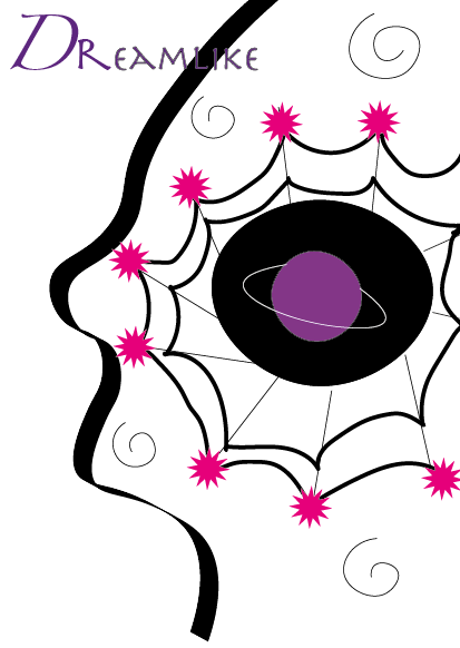
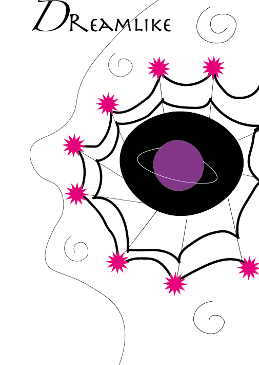
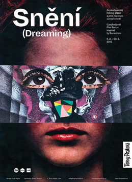
 My poster which is a hypothetical art exhibition titled “dreamlike” I feel really encapsulates the word “dream,” we dream with our brains, our dreams are wacky and fun. My overriding theme was surrealism and I was inspired by surrealist artwork to make my poster feel out of this world and not ordinary. I feel achieved this by ensuring every element of my poster was something you had to think about in order to discover it’s meaning, I wanted there to be several elements which tied in together so that you can come up with almost any meaning as there is endless possibilities. The brain itself is a solar system of thoughts and the thoughts are shown as planets, the technicality of the human brain which allows us to dream and come up with such wacky ideas to create surrealism is shown through the use of a spiders web because when I think of a brain I often think of a web which all links and works together in order to come up with an idea. I want my poster to be striking on the page and to look like something no one’s ever seen because that is what surrealism is, you are stepping out of the ordinary and mundane into something new, exciting and unreal. There is a mix of nature and the nature we are completely alien to which is our solar system, despite it being real it feels especially surreal to us because it is so hard to comprehend I like to view it as almost a dream as we still don’t fully understand how our own minds work so we could be dreaming most of our ideas.
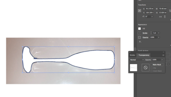
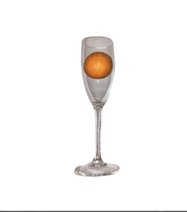
Photography started in the middle of the 19th century beginning with the Daguerreotype, 1837 by Louis Daguerre. These photographic images at the time where seen as magical and was only really accessible to the rich. After time there was over 3,000,000 by 1853 after its popularity grew. The long exposure times resulted in them being unable to be reproduced and where one off. Overtime Daguerreotypes where replaced by wet plate glass negatives which had negative images which where contact printed. As photography continued to progress cameras became better and better finally resulting in depth of field, this helps make the images look less flat and can single out a specific subject more easily than before. Different lenses are then introduced which help quality in images and can create different effects visually. For a conceptual design I photographed an orange and a wine glass and put them together with adobe illustrator. In order to do this, I removed the background of the wine glass first by right clicking and then selecting the “windows” bar, I then selected “transparency’, after this I used the curved tool in order to trace the image so I can create a mask. The curvature tool is very helpful as it helps me move around the harder curves in comparison to the rounded orange. This helped me achieve a seamless cut out. After this I selected both images at once the background and outline and selected “mask” this revealed the glass on a plain white background instead of the original one. I then proceeded to do the same thing to the orange which I found a lot easier due to its consistent curvature. After this I placed the orange into the glass, because both backgrounds are removed, they now fit together rand you would think the orange is actually in the glass.
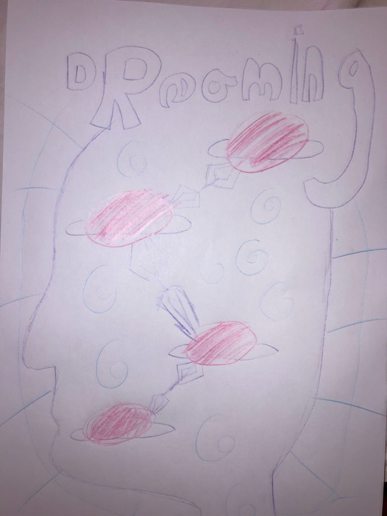
Using a range of tools, I visually combined the range of motifs I had sketched out and decided on for my poster. A human head was needed to be created for my poster in order to get across this design I used the curvature tool to create a silhouette side profile of a stylised human head. I was not too bothered about the realism of the head as I want surrealism however I wanted to ensure its recognisability for what it was. The lines from using the tool where seamless and helped bring the head together. For one of my motifs I wanted to incorporate space and the galaxy as well as the idea of it being a web like the web of a human brain. I achieved this by creating a Saturn in the centre of the head to represent almost a solar system of brain cells working together, these brain cells are represented through stars which I created through shapes. Saturn was compiled together by using the curvature tool in order to create the shape of the planet and filling it in, then proceeding to use the same tool for the ring. I picked Saturn in particular to overcome any problems I may encounter with it not looking like a planet due to lack of detailed texture, therefor the ring gives it a distinctive touch, so it is unrecognisable yet simple. The web itself I wanted to appear dreamlike, so I didn’t want it to be too perfect as dreams are often angular in a way and I also wanted to portray a real spider web, linking in with nature and the way spider webs are built in order to catch flies. I wanted the web to portray the way humans catch and absorb knowledge. I achieved this web through the use of calligraphic strokes for part of the web, contrasted with the pen tool.

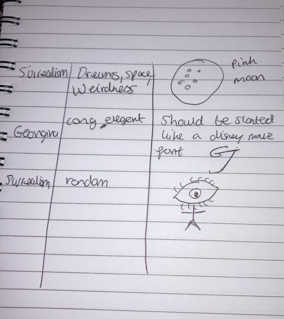
Within my design ideas I decided I wanted to take an approach which incorporated the human mind and space. I decided this because space is supposed to be endless, it is a web that is constantly evolving and getting bigger. I feel this relates to the human brain as it is a web of thoughts and ideas which are constantly evolving and expanding. These two elements I knew I wanted to incorporate from the get-go. I jotted down my ideas and tried to come up with a way to connect them. The galaxy has planets and I like to think of it as a web as everything is in some way connected, the human brain is also a web of thoughts and ideas, I wanted planets to connect in some way within a human head like the way thoughts do. So sketched a quick poster of what I envisioned. I want the colour to include purples and pinks because I feel it is rarely found in nature, only when you look up at the sky and see a sunset. I feel that reflects the out of this world feel I am reaching for. When I think of the mind, I often think of how many thoughts we have buzzing around, our thoughts mash and become jumbled when we are asleep which are our dreams. I feel I want the poster to not only reflect the web of thoughts which are constantly expanding like a galaxy but also a dream as the planets are pictured bouncing around the head. I want to include other elements to make it seem more randomised and surreal. My thoughts on dreams also depicted feeling alone as we only dream with ourselves, I want this to show through on my poster by giving some dark blank spaces within the head where there is a sense of loneliness and struggle with the never-ending possibility of expansion.
Surrealism helps the viewer step into another world, another reality. It often combines everyday mundane ideas with out of this world imagery. The audience for surrealism can be dreamers, they seek thrill and excitement with the images they see and also want to uncover a deeper meaning. Most surrealist images help the audience to escape what is normal and step into something different and unique. Surrealism is not our world but a dream like version with endless possibilities.
This image below uses two separate images to create one entity for this specific art exhibition poster. It showcases a photograph of a normal woman’s face looking up. Across the image is a vibrant drawing with only her eyes peeking out, taking the shape of her face in an artistic unique way. The drawn part of her face is pictured between two grey walls, contrasting her colourful galactic nose and eyes which appears to have used several different images and shapes to come together and create the features. This poster seems to have several meanings within it. One showcases the hidden complexity of humans by contrasting the plain photograph of her face as it is with an overcast of what we are made up of and how fascinating and exciting that is through colour. The grey walls used within the art image which align with the black photographic background help push the narrative that humans are so much more than their surroundings as the colours contrast and signify very different meanings. Grey being mundane and boring, and rainbow being something out of the ordinary and exciting. The artwork coming across her eyes may signify that she is daydreaming, and that world is what she sees, it may also signify multiple dimensions and that there are two sides to our world with endless possibilities. There is a lot to unpack with surrealism.
My campaign is surrealist bright artwork which is the opposite to the mundane lives people lead and filled with colour.
In New York, Sarah Grillo designed a brand and campaign for a community event called Revive L. The design included black and white photography with cleverly integrated colourful illustrations in order to create a different world. Sarah stated she photographed the commuters and then illustrated what “they’d rather be doing-drinking a cocktail or eating a taco”. I feel this campaign sends out a good message that everybody has complex and interesting lives beneath what you see and photography doesn’t have to comply with this; it can show what’s beneath the surface even if it’s not real.
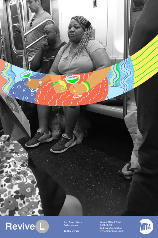
The illustrations show a clear contrast by being a total opposite to the background.
The use of colour of black and white contrasted with the bright colourful illustrations which take you into a different world is a great reflection on a campaign that brings peoples dreams into a reality through art. A lot like surrealist art which is often inspired by dreams. The illustrations themselves look very animated and childlike, bringing out that nostalgia of being carefree and the opposite to the mundane contrasted with the illustrations. Surrealism is often a random integration of things which almost make sense but don’t at the same time which I feel is represented through this campaign through the random use of colour and shapes along with the background photo. The people’s positions on the train are shown to almost align with the dreamlike fantasy illustrations. For example
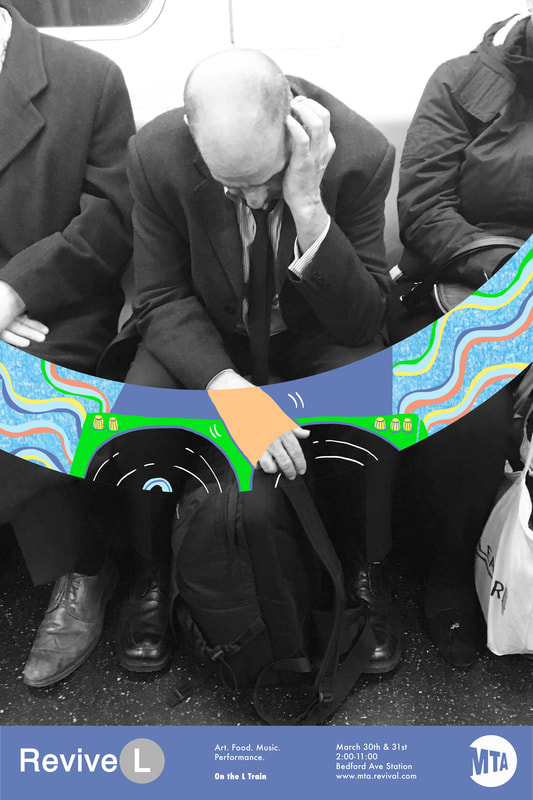
There is a new lease of life through through the campaign as it brightens what people might have thought was a bad day through art. I feel this is important as it brings something magical to peoples lives and sees the excitement in what would be usually seen as uninteresting.
References:
Fig 1 & 2: http://www.sarahleegrillo.com/revive-l.html#
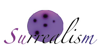
I decided I wanted to create something especially surreal that told a story like in a dream. I did this by drawing fire and creating the shape of fire coming out of the moon as if it had been caught on fire by the sun. This reflects the surrealist art I’m inspired by as it often doesn’t make sense but can still be connected somehow. I added the shape of stars and dotted them within the fire. This gave the illusion of shooting stars. The use of fire also made sense to me because it was two different worlds colliding as there is no oxygen to fuel fire in space so the pairing of both earth and space helped create a surrealist theme.
I took a really abstract approach with the shape of the fire as I wanted the fire to not look real like the moon but still be recognisable for what it was. I made the shapes a lot bigger in order to make the design the forefront and to keep the colour gradient of the font exposed.
The colour of the fire I wanted to be the normal colours that a fire would have so it was recognisable and also because those colours contrast a lot with the deep purple of the moon. I decided I didn’t want to blend the colours together as much as the moon as I wanted that contrast between the two shapes to be clear. The moon being caught on fire is almost a silly childlike idea you would find in a children’s book or film which is exactly what I wanted to portray as it connects to my inspirations of Disney films. The random idea also links to dreams and surrealist art which is often inspired by dreams.
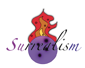
When adding more colour, I decided I wanted to change the moon to a deep purple in order to make it stand out more. I created my own graphic out of circular shapes and blurred them in order to create the purple moon. I wanted the moons appearance to seem more animated then the sample from my previous logotype as I wanted it to reflect the Disney movie childlike inspirations I had. When surrealism comes in, I feel making the moon such a abstract colour helps get that message across. The fact that it doesn’t look like a real moon but almost a dreamlike version of a moon gives this message of surrealism too.
I created a light purple to dark purple gradient within the moon to give the appearance of shadows which would be casted on the moon. I also created a purple blur around the craters to make them catch people’s eyes. For the font itself I decided I wanted to change the colours to match the gradient of the moon, this I feel helps bring the font together. The first two letters I made a lighter purple then the middle letters I made black to ensure a contrast as they overlap the moon and the last letter, I made a deep blue/purple. The overall added colour I feel helps enhance my surreal dreamlike ideas as the colours pink and purple are not easily found in nature and especially not when you think of the moon. The font “surrealism” is created to look slanted and off balance which reflects the off-balance surreal nature of the moon itself. The colours being blurred and blended into one another really gives the moon the dreamlike appearance. Surrealist art is often said to be inspired from peoples dreams as it is random and out of this world
One of the main features presented within my logo is a pink moon. This represents the dreamlike aesthetics found on Instagram which Inspire me. They’re often pictures of things which are edited to almost become surreal like the pink moon. The colour pink itself is also really representative of myself as I often am intrigued by this colour within photography as it is very bright and eye-catching. The use of baby pink I feel also helps represent childlike nostalgia connected to my love for animated films as a child which included this colour a lot.
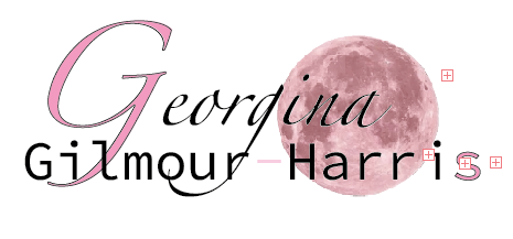
To match this the first and last letter are also pink in order to bring my logo together and for it to look more visually appealing.
The font itself can be seen as abstract and different due to the font difference of the first letter to the rest and how it is seen as bold and large. Its overall feel is extremely contrasted in order to create a eye-catching effect and draw your eyes in. I brought the fonts very close together in order to let it blend to create a sense of togetherness as my first and last name. This is because I wanted to ensure that it was all connected. I also achieved this look by putting the moon under the font, so it overlapped and looked seamless. I outlined the first and last letter to create a sense of boldness. The large first letter of my name is a representative of what is often used in child animated Disney movies. Overall my logo is abstract and different which is a aesthetic I was drawn to throughout my life and has inspired a lot of my work when creating.
references:
The pink moon:
https://www.kindpng.com/imgv/ixiJiww_pink-moon-png-pink-moon-transparent-background-png/