One of the main features presented within my logo is a pink moon. This represents the dreamlike aesthetics found on Instagram which Inspire me. They’re often pictures of things which are edited to almost become surreal like the pink moon. The colour pink itself is also really representative of myself as I often am intrigued by this colour within photography as it is very bright and eye-catching. The use of baby pink I feel also helps represent childlike nostalgia connected to my love for animated films as a child which included this colour a lot.
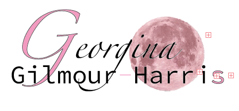
To match this the first and last letter are also pink in order to bring my logo together and for it to look more visually appealing.
The font itself can be seen as abstract and different due to the font difference of the first letter to the rest and how it is seen as bold and large. Its overall feel is extremely contrasted in order to create a eye-catching effect and draw your eyes in. I brought the fonts very close together in order to let it blend to create a sense of togetherness as my first and last name. This is because I wanted to ensure that it was all connected. I also achieved this look by putting the moon under the font, so it overlapped and looked seamless. I outlined the first and last letter to create a sense of boldness. The large first letter of my name is a representative of what is often used in child animated Disney movies. Overall my logo is abstract and different which is a aesthetic I was drawn to throughout my life and has inspired a lot of my work when creating.
references:
The pink moon:
https://www.kindpng.com/imgv/ixiJiww_pink-moon-png-pink-moon-transparent-background-png/