I decided I wanted to create something especially surreal that told a story like in a dream. I did this by drawing fire and creating the shape of fire coming out of the moon as if it had been caught on fire by the sun. This reflects the surrealist art I’m inspired by as it often doesn’t make sense but can still be connected somehow. I added the shape of stars and dotted them within the fire. This gave the illusion of shooting stars. The use of fire also made sense to me because it was two different worlds colliding as there is no oxygen to fuel fire in space so the pairing of both earth and space helped create a surrealist theme.
I took a really abstract approach with the shape of the fire as I wanted the fire to not look real like the moon but still be recognisable for what it was. I made the shapes a lot bigger in order to make the design the forefront and to keep the colour gradient of the font exposed.
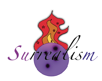
The colour of the fire I wanted to be the normal colours that a fire would have so it was recognisable and also because those colours contrast a lot with the deep purple of the moon. I decided I didn’t want to blend the colours together as much as the moon as I wanted that contrast between the two shapes to be clear. The moon being caught on fire is almost a silly childlike idea you would find in a children’s book or film which is exactly what I wanted to portray as it connects to my inspirations of Disney films. The random idea also links to dreams and surrealist art which is often inspired by dreams.