When adding more colour, I decided I wanted to change the moon to a deep purple in order to make it stand out more. I created my own graphic out of circular shapes and blurred them in order to create the purple moon. I wanted the moons appearance to seem more animated then the sample from my previous logotype as I wanted it to reflect the Disney movie childlike inspirations I had. When surrealism comes in, I feel making the moon such a abstract colour helps get that message across. The fact that it doesn’t look like a real moon but almost a dreamlike version of a moon gives this message of surrealism too.
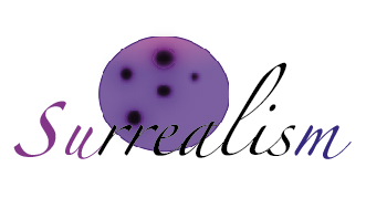
I created a light purple to dark purple gradient within the moon to give the appearance of shadows which would be casted on the moon. I also created a purple blur around the craters to make them catch people’s eyes. For the font itself I decided I wanted to change the colours to match the gradient of the moon, this I feel helps bring the font together. The first two letters I made a lighter purple then the middle letters I made black to ensure a contrast as they overlap the moon and the last letter, I made a deep blue/purple. The overall added colour I feel helps enhance my surreal dreamlike ideas as the colours pink and purple are not easily found in nature and especially not when you think of the moon. The font “surrealism” is created to look slanted and off balance which reflects the off-balance surreal nature of the moon itself. The colours being blurred and blended into one another really gives the moon the dreamlike appearance. Surrealist art is often said to be inspired from peoples dreams as it is random and out of this world